

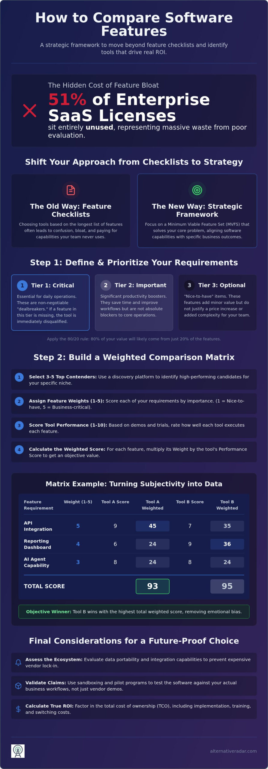
In 2026, a record 51% of enterprise SaaS licenses sit entirely unused. This massive waste happens because most buyers choose tools based on the longest list of bullet points rather than actual workflow utility. You’ve likely felt the frustration of feature parity confusion, where every platform looks identical on a landing page but performs differently in practice. It’s difficult to distinguish between high-value tools and expensive feature bloat that your team will never touch.
This guide provides a professional-grade methodology to strip away marketing hype and identify the software features that actually drive ROI for your business. You’ll learn how to compare software features using a repeatable matrix that accounts for the latest technical standards and AI agent capabilities. We will break down the ISO/IEC 25010:2023 quality characteristics, audit for hidden technical limitations, and build a selection framework that ensures your choice remains relevant for years. By the end, you’ll have the clear data and logic needed to justify your decision to any stakeholder.
Key Takeaways
- Shift from passive feature checklists to a strategic framework that aligns software capabilities with specific business outcomes.
- Master how to compare software features by building a repeatable evaluation matrix using objective data from centralized discovery platforms.
- Assess the surrounding ecosystem and data portability requirements to prevent expensive vendor lock-in and long-term technical debt.
- Implement sandboxing and pilot programs to validate vendor marketing claims against your actual business workflows and data.
- Identify the true ROI of a new tool by calculating the total cost of ownership and the hidden expenses of switching platforms.
Establishing a Strategic Feature Comparison Framework
Effective software selection isn’t about finding the tool with the most buttons. It’s about alignment. Most vendors use feature parity as a marketing illusion to convince you their product is equivalent to a market leader, but this surface-level checklist rarely accounts for how a tool actually performs in your specific environment. Understanding how to compare software features requires shifting your focus from what the software can do to what your business needs to achieve. A software feature comparison is a systematic evaluation of functional and non-functional requirements against a specific use case.
Instead of chasing a comprehensive list, aim for a Minimum Viable Feature Set (MVFS). This approach prioritizes the smallest group of features required to solve your primary problem without introducing unnecessary complexity. Learning how to compare software features through the lens of an MVFS ensures you don’t get distracted by flashy demos that lack substance. When you focus on the MVFS, you reduce the risk of paying for unused licenses and minimize the technical debt associated with bloated platforms.
Defining Your Core Workflow Requirements
Start by auditing your team’s current frustrations. Don’t look at new tools yet; look at where your current process breaks. Map these gaps to Jobs to be Done (JTBD). For example, don’t look for a generic reporting feature if the real job is providing stakeholders with weekly ROI updates. Identifying these specific outcomes helps you spot Dealbreaker features. These are non-negotiable requirements, like a specific API integration or a CCPA-compliant data handling protocol, that immediately disqualify a contender if they are missing. Documenting these before you engage with vendors keeps the evaluation objective.
The “Must-Have” vs. “Nice-to-Have” Distinction
Apply the 80/20 rule to your evaluation. Usually, 80% of your team’s value comes from just 20% of the software’s features. The remaining 80% of the features often constitute feature bloat, which increases the learning curve and the subscription cost. Avoid the Swiss Army Knife trap where a tool claims to do everything but performs each task poorly. A specialized tool often provides better long-term ROI than a mediocre all-in-one suite.
Create a tiered list of requirements to keep your search focused:
- Tier 1 (Critical): Essential for daily operations. If this is missing, the tool is useless.
- Tier 2 (Important): Significant productivity boosters that save time but aren’t blockers.
- Tier 3 (Optional): Nice-to-have items that don’t justify a price hike or added complexity.
This hierarchy prevents you from overpaying for flashy additions that your team will likely ignore. By the time you reach the testing phase, you’ll know exactly which features carry the most weight in your decision-making process.
How to Build a Software Comparison Matrix
Static review grids provide a general overview of market leaders, but they rarely account for your specific internal constraints. To find the right fit, you must build a custom comparison matrix. This tool transforms subjective opinions into objective data. It allows you to filter out noise and focus on the mechanics of how to compare software features based on your unique operational needs.
Step 1: Select 3-5 top contenders. Use a discovery platform like Alternative Radar to identify candidates that fit your specific niche. This platform is particularly useful for surfacing high-performing alternatives that major aggregators might overlook.
Step 2: Structure your grid. Place your functional requirements on the Y-axis and the names of the software contenders on the X-axis.
Step 3: Assign a weight to each requirement. Use a scale of 1 to 5. A score of 1 represents a “nice to have” feature, while a 5 indicates a business-critical requirement.
Step 4: Score each software on a scale of 1 to 10. Base these scores on how well the tool executes that specific feature. You can gather this data through demos, trial periods, or technical documentation.
Step 5: Calculate the weighted score. Multiply the weight by the performance score for each cell and sum the totals for each product. The highest total identifies the objective winner. Learning how to compare software features using this quantitative approach removes emotional bias from the purchasing process.
Essential Data Points for Your Grid
Your grid needs three distinct categories of data to provide a complete picture. Functional features describe what the software actually does, such as automation capabilities or specific integrations. Operational features cover the “how” of the software. This includes guaranteed uptime, support response times, and the quality of technical documentation. Economic features address the true cost of the tool. Look beyond the subscription price to find hidden implementation costs, such as data migration fees or required consulting hours.
Weighting Features for Objective Scoring
Not all features carry equal value. A common mistake is weighting advanced analytics as a 5 while giving “Ease of Use” a 2. If your team cannot navigate the interface, they will never use those advanced features. Involve your power users in the weighting process. Ask them which features solve their daily bottlenecks. This ensures team buy-in before the tool is even purchased.
The final calculation follows a simple logic: (Weight x Performance) = Value. By quantifying these variables, you move beyond marketing claims and see which tool provides the most utility per dollar spent. This is the most effective method for evaluating software without falling for vendor hype.
Beyond the Checklist: Comparing Architecture and Ecosystems
A feature list only tells you what a tool does today. It doesn’t tell you how it will survive in your tech stack tomorrow. Understanding how to compare software features effectively means looking at the architecture supporting those features. A robust ecosystem of third-party plugins and community support often dictates long-term viability more than a single proprietary tool. If a vendor lacks a vibrant developer community, you risk being stuck with stagnant functionality that doesn’t evolve with industry trends.
Assess vendor lock-in early. Ask how easy it is to export your data in a usable format. If a tool makes data extraction difficult, you’re not just buying a service; you’re buying a cage. For those prioritizing flexibility, an Open Source CRM Software Comparison provides a clear look at how open standards prevent these traps. High data portability ensures that your business remains agile if your needs change in 12 months.
Evaluating Integration Depth and API Access
Native integrations are superior to “Zapier-only” connections. Native options typically offer lower latency and more reliable data syncing. When you evaluate how to compare software features related to connectivity, audit the API documentation. Look for RESTful standards and check for strict rate limits that might throttle your workflows. While customizability sounds like a benefit, it’s a double-edged sword. Small teams often lack the dev resources to maintain complex custom builds, making out-of-the-box stability more valuable than a blank canvas.
Assessing Security Standards and Compliance
Security features are not add-ons but foundational requirements in 2026. You must compare SOC2, GDPR, and HIPAA compliance levels across your top contenders to ensure they meet your legal obligations. A tool that lacks Single Sign-On (SSO) or multi-factor authentication (2FA) creates a liability for your IT department. Audit logs are equally critical. They provide the transparency needed for compliance and internal security reviews. Don’t settle for a vendor that treats these as enterprise-tier upsells. If the security architecture is weak, the most advanced features in the world won’t protect your business from a breach.
Validating Feature Claims Through Sandboxing
Marketing materials often exaggerate capabilities. To truly understand how to compare software features, you must move beyond the vendor’s slide deck and into a sandbox. A sandbox is an isolated environment where you can test the software’s mechanics without risking your production data. Don’t rely on pre-recorded demos or polished screenshots. Instead, request a trial that allows for a small-scale pilot program with your most frequent power users. These individuals will find the edge cases that a salesperson might overlook.
Run a stress test on high-volume tasks that are central to your operations. If your workflow requires frequent bulk data imports, attempt to upload a significant dataset during the trial. Many tools look fast with ten rows of data but crawl when processing ten thousand. During sales demos, challenge the representative to show you a feature live. If they claim a feature is “on the roadmap,” treat it as non-existent for your current evaluation. Vaporware is a common industry pitfall; only base your decision on what is functional today.
Setting Up a Real-World Test Environment
Avoid using the vendor’s “dummy data” because it’s designed to make the system look perfect. Import a sanitized subset of your own records to see how the search filters, sorting, and reporting actually handle your specific data structures. Check for feature parity between the mobile app and the desktop version. Many vendors offer a robust web experience but a stripped-down mobile app that lacks essential tools. Measure the Time to Value (TTV). If it takes your team three days of training to perform a basic task, the tool’s complexity might outweigh its benefits. Before committing, use Alternative Radar to cross-reference your testing findings with neutral, advisor-style analysis of other top contenders.
Red Flags During the Evaluation Period
Watch for performance lag when multiple users log in simultaneously. If the interface stutters during peak usage, it won’t scale with your business. A poorly designed UI that hides essential features behind four or five clicks is another major warning sign. This friction eventually leads to low adoption rates and team frustration. When you learn how to compare software features through active testing, these UI bottlenecks become obvious. If the software feels heavy or unintuitive during a two-week trial, it will likely become a significant burden over a three-year contract.
Final Selection: From Comparison to Implementation
The final stage of your evaluation moves from technical validation to financial and logistical reality. Even the most capable tool can become a liability if the transition costs outweigh the operational benefits. To finalize your choice, you must look beyond the subscription sticker price and evaluate the long-term impact on your resources. Mastering how to compare software features in this phase requires a cold, data-driven look at the total cost of ownership and the friction of the transition itself.
Presenting your findings to stakeholders is the final hurdle. Use the weighted matrix you built in the earlier stages to demonstrate a logical, objective path to your conclusion. This removes the “gut feeling” from the conversation and provides a clear justification for the budget. For a deeper look at specific market options, consult our guide on Finding the Best Alternative to Popular Software to ensure no high-performing contenders were missed during your initial sweep.
Calculating Total Cost of Ownership (TCO)
TCO accounts for every dollar spent from the moment of purchase through the end of the software’s lifecycle. This includes one-time migration fees, mandatory training sessions, and the potential downtime during the cutover period. Compare pricing models carefully. While seat-based pricing is predictable, usage-based models can scale better for seasonal businesses but risk unexpected spikes in cost. If you’re considering open-source alternatives, factor in the cost of internal maintenance. A “free” tool often requires expensive developer hours for hosting, security patches, and updates, which can eventually exceed the cost of a premium SaaS subscription.
Leveraging Alternative Radar for Faster Discovery
Efficiency is the core of a successful procurement process. Manual research is often biased toward the vendors with the largest marketing budgets, causing you to overlook agile, “under-the-radar” competitors that offer better specific utility. Alternative Radar functions as a digital scout, centralizing the pros, cons, and raw data for free, open-source, and premium tools in a single location. This neutral analysis can save your team 10 or more hours of manual searching and data entry. By providing a high-quality filter for information, it allows you to focus your energy on how to compare software features through active testing rather than basic discovery. Use this centralized data to populate your comparison matrix quickly and ensure your final selection is based on the widest possible field of qualified candidates.
Securing Your Next Tech Investment
Choosing the right tool is no longer about matching bullet points on a landing page. It’s about ensuring your software stack aligns with your specific workflow and long-term business goals. By prioritizing the Minimum Viable Feature Set and validating vendor claims through sandboxing, you eliminate the risk of paying for unused bloat. Mastering how to compare software features using a weighted matrix transforms a stressful procurement process into a repeatable, data-driven system. This approach ensures your chosen tool remains functional and cost-effective as your team scales.
You don’t have to start your research from scratch. Our platform provides objective, data-driven comparisons that help you discover free and open-source gems you won’t find on major directory sites. You can save hours on procurement research by accessing centralized pros, cons, and technical specifications in one place. This neutral analysis empowers you to make smarter choices that value your time and resources.
Find the perfect software alternative on Alternative Radar and make your next software choice with absolute confidence. Your team’s productivity depends on the tools you select today.
Frequently Asked Questions
What is the best way to compare software features for a small team?
Small teams should prioritize out-of-the-box functionality and ease of use over deep customizability. Focus on the Minimum Viable Feature Set (MVFS) to solve immediate bottlenecks without overpaying for enterprise-level complexity. Use a simple weighted matrix to rank tools based on current team frustrations rather than future-proofing for hypothetical needs that might never materialize.
Is there a template for a software comparison matrix?
A standard matrix uses a grid with functional requirements on the Y-axis and software names on the X-axis. You can build this in any spreadsheet by assigning a weight from one to five to each requirement and a performance score from one to ten to each product. This quantitative approach is the most effective method for how to compare software features without emotional bias.
How do I know if a software feature is actually “essential”?
A feature is essential if its absence stops a core business process or violates a legal requirement like GDPR. Map each feature to a specific Job to be Done (JTBD) to see if it directly impacts your primary objective. If a feature only provides incremental convenience without solving a major bottleneck, it’s a “nice-to-have” rather than a “must-have.”
What are non-functional requirements in software comparison?
Non-functional requirements define the system’s operational qualities rather than specific tasks. These include security standards like SOC2 compliance, system uptime, API rate limits, and data portability. While functional features describe what the software does, non-functional requirements describe how the system performs under stress and how it protects your data over the long term.
How much time should a software feature comparison take?
A thorough evaluation typically takes between two and four weeks for most mid-sized tools. This timeframe allows enough room for an initial discovery phase, building a comparison matrix, and running a short pilot program with power users. Rushing the process leads to overlooked technical debt; however, dragging it out beyond a month often results in analysis paralysis.
Can I trust user reviews when comparing software features?
User reviews are useful for spotting recurring technical bugs or poor support, but they shouldn’t be your primary data source. Reviews are often subjective and based on specific use cases that might not match your internal environment. When learning how to compare software features, prioritize raw data and internal sandboxing over anecdotal evidence found on third-party review platforms.
What is the difference between a feature and a benefit in software evaluation?
A feature is a technical capability, such as “AES-256 encryption,” while a benefit is the outcome, such as “secure client data protection.” Features describe the tool’s mechanics, but benefits explain the value those mechanics provide to your business. Always evaluate software based on whether the technical features deliver the specific benefits your team requires to hit their KPIs.