
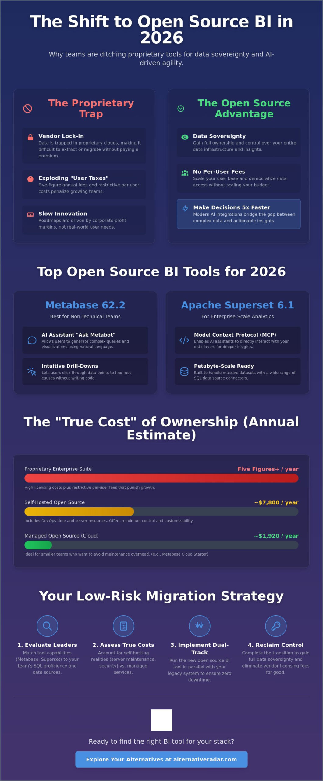
Why are you still paying five-figure annual licensing fees for a software suite that locks your data inside a proprietary cloud? It’s a common frustration for growing teams where success often leads to higher “vendor taxes” and restrictive per-user costs. You need enterprise-grade analytics, but you shouldn’t have to sacrifice data ownership or deal with steep learning curves for your non-technical staff. Finding the right open source BI tools for data visualization is no longer just a cost-saving measure; it’s a strategic move for organizations that prioritize AI-driven agility and full infrastructure control.
This guide helps you discover how to achieve professional storytelling without the restrictive licensing fees of proprietary software. We’ll compare the latest 2026 releases, including Apache Superset 6.1 and Metabase 62, while breaking down the true costs of self-hosting versus managed cloud services. By the end, you’ll know exactly how to build a scalable, intuitive BI stack that empowers your team to make decisions up to five times faster using modern AI integration. We’ve done the testing so you can focus on the insights.
Key Takeaways
- Reclaim control over your infrastructure by switching to software that prioritizes data sovereignty and eliminates per-user licensing fees.
- Compare the market leaders among open source BI tools for data visualization to determine which platform fits your specific technical requirements.
- Select the ideal platform for your stack by matching tool capabilities to your team’s SQL proficiency and native data source connectors.
- Account for the operational realities of self-hosting, such as server maintenance and security patching, to avoid unexpected technical debt.
- Implement a low-risk migration using a dual-track strategy that ensures uptime while you transition from proprietary systems to open alternatives.
What is Open Source BI and Why Does It Matter in 2026?
Open source BI refers to software where the source code is public, allowing anyone to inspect, modify, and enhance it. Unlike proprietary Business intelligence software that hides its inner workings behind a paywall, open source platforms rely on community-driven development to solve problems. This transparency ensures that the tool evolves based on user needs rather than a corporate profit margin. In 2026, this model has become the standard for organizations that refuse to be sidelined by restrictive software agreements.
The industry has seen a massive shift from “free as in beer” to “free as in speech.” It isn’t just about the initial price tag; it’s about data sovereignty. Major SaaS vendors often build “walled gardens” that make it easy to ingest data but difficult to extract or analyze it without paying a premium. Open source tools break these walls. They give you full ownership of your data infrastructure, ensuring that your insights stay within your control and your budget.
A major trend in 2026 is the rise of AI-augmented analytics within the open-source ecosystem. Projects like Apache Superset 6.1 now include the Model Context Protocol (MCP), which allows AI assistants to interact directly with your data layers. This innovation bridges the gap between complex SQL queries and intuitive natural language insights, providing a level of agility that was once exclusive to high-priced proprietary platforms.
The Core Benefits of Open Source Data Visualization
Scaling a data-driven team often leads to a “user tax” on proprietary platforms. With open source BI tools for data visualization, you can expand your user base without scaling your licensing budget. You pay for the infrastructure you use, not for each person who needs to view a dashboard. This democratization of data allows every department to access insights without financial friction.
Customizability is another critical advantage. If your business logic requires a specific chart type or a unique data connector, you can modify the source code or use a plugin SDK to build it. Security-conscious industries also favor this route because they can host the entire stack on-premises or in a private cloud, maintaining strict compliance with data residency laws.
Open Source vs. Proprietary BI: The 2026 Landscape
When evaluating the 2026 landscape, you must consider the total cost of ownership (TCO) over a three-year period. While open source eliminates licensing fees, it introduces costs for infrastructure and maintenance. For example, a small team might spend approximately $1,920 annually for a managed service like Metabase Cloud Starter, while a self-hosted deployment could cost $7,800 in DevOps time and server resources. However, for enterprise-scale operations, the savings on licensing often outweigh these operational costs by a significant margin.
Community-driven roadmaps often outpace corporate ones because they solve real-world problems in real-time. By choosing open source, you avoid vendor lock-in. You aren’t tied to a specific cloud provider or a single company’s financial health. This independence ensures your BI stack remains a flexible asset that grows with your organization.
Top Open Source BI Tools for 2026: The Alternative Radar Shortlist
Selecting the right platform requires matching technical capability with your team’s actual skill set. In 2026, the market has matured beyond basic charts. Modern open source BI tools for data visualization now integrate AI assistants and semantic layers that were once exclusive to expensive proprietary suites. Whether you need a simple no-code interface or a system that handles petabyte-scale data, the following shortlist represents the highest-performing options available today.
Metabase: Best for Non-Technical Teams
Metabase 62.2 remains the primary choice for organizations that want to democratize data without extensive training sessions. Its standout feature is “Ask Metabot,” an AI assistant that allows users to generate complex queries using natural language. You don’t need to know SQL to create a dashboard; you simply type a question and the system builds the visualization for you. The platform also offers intuitive visual drill-downs, letting users click through data points to find root causes instantly. It’s a key reason why Metabase is frequently cited as a leader in popular open source business software 2026.
Apache Superset: Scaling to the Moon
Apache Superset 6.1.0 is the enterprise-grade powerhouse of the group. Originally developed at Airbnb, it’s built to handle massive, cloud-native datasets that would crash lesser tools. The 2026 release includes a Model Context Protocol (MCP), allowing external AI assistants to interact seamlessly with your data models. If your team is SQL-heavy, the integrated SQL Lab provides a high-velocity environment for complex data exploration. With a rich gallery of over 50 visualization types, it’s the preferred choice for companies that need deep customization and high-performance rendering. If you find yourself overwhelmed by options, you can always compare these tools side-by-side to see which fits your specific infrastructure.
Grafana: Beyond Business Metrics
Grafana 13.0.2 dominates the world of operational and time-series data. While other tools focus on sales or marketing KPIs, Grafana excels at visualizing IoT sensor data, server health, and real-time logs. Its sophisticated alerting engine goes beyond static reports, triggering actions based on complex multi-condition logic. You can mix data from multiple sources, such as Prometheus, SQL, and Elasticsearch, into a single panel for a unified view of your operations. If your priority is real-time monitoring rather than historical business analysis, Grafana is the logical selection.
For niche requirements, two other tools deserve attention. Lightdash is the best fit for teams that use dbt (data build tool) as their primary transformation layer, as it turns your dbt models into a full BI suite automatically. Evidence offers a unique “code-first” approach, allowing analysts to build high-quality, reproducible reports using markdown and SQL. Each of these tools solves a specific bottleneck in the modern data stack.
How to Choose the Right BI Tool for Your Data Stack
Selecting the ideal platform requires an honest assessment of your team’s technical baseline and your existing data architecture. Many organizations rush into a deployment based on a tool’s popularity rather than its compatibility with their stack. You must decide whether you prioritize developer flexibility or end-user accessibility. A mismatch here leads to low adoption rates and a reliance on data engineers to build even the simplest reports. Don’t let your visualization layer become a bottleneck for decision-making.
SQL-First vs. No-Code Interfaces
Assess your team’s daily workflow. If your organization relies on data engineers and analysts who prefer writing complex joins, a SQL-first tool like Apache Superset provides the granular control they need. However, if your primary users are in marketing or sales, they’ll require a no-code interface. Metabase excels here by allowing non-technical staff to build dashboards through a visual “question” builder. Choosing the wrong persona-fit results in either a “shadow BI” culture where teams use their own spreadsheets or a constant backlog of tickets for your data team.
The semantic layer serves as a single source of truth for metrics, ensuring that a specific KPI like “monthly recurring revenue” is calculated identically across every department. Without this layer, different teams often report conflicting numbers for the same metric. Ensure your chosen tool supports a robust semantic layer or integrates with external ones like Cube or dbt to maintain data consistency as you scale.
Integration with Modern Data Warehouses
Modern warehouses like Snowflake, BigQuery, and Databricks charge based on compute usage. Look for open source BI tools for data visualization that support “push-down” queries. This feature ensures the BI platform sends the heavy computational work to the warehouse rather than trying to process it in the application layer. This approach significantly reduces data latency and helps control your cloud infrastructure costs. You should also verify if the tool supports real-time streaming for operational dashboards or if it relies on cached data refreshes to save resources.
Integrating these insights with your customer data is vital for a 360-degree view of your business. Review our open source CRM software comparison to see how to align your visualization layer with your sales pipeline data. Whether you deploy via Docker, Kubernetes, or a managed cloud service, the goal is a seamless flow of information from your warehouse to your decision-makers. Evaluate your connectors early to avoid the trap of manual data exports and broken CSV uploads.
The “Hidden” Costs of Free: Maintenance and Hosting
Open source software is often described as “free,” but this term refers to the license rather than the total cost of ownership. When you deploy open source BI tools for data visualization, you essentially trade monthly per-user fees for internal operational expenses. You become your own service provider. This means your team is responsible for server uptime, security patches, and version upgrades. For a small team of 15 users, a self-hosted Metabase deployment can cost approximately $7,800 annually when factoring in infrastructure and DevOps time. You must determine if your organization possesses the “sweat equity” to manage these systems or if your resources are better spent elsewhere.
Self-Hosted vs. Managed Cloud
The choice between self-hosting and a managed service often comes down to control versus convenience. DIY hosting gives you total data sovereignty, but it introduces the hidden risks of switching to free open-source software, such as unpatched vulnerabilities or configuration errors. Managed providers like Preset for Superset or Metabase Cloud handle the heavy lifting for a predictable fee. If you opt for a managed provider, use this checklist to evaluate their suitability:
- Automated Backups: Does the provider offer point-in-time recovery?
- Single Sign-On (SSO): Can you integrate with Okta or Google Workspace?
- VPC Peering: Can the BI tool connect securely to your private database?
- SLA Guarantees: What is the promised uptime for your dashboards?
Technical debt is another factor. Community versions rarely include dedicated support. If a critical dashboard breaks during a board meeting, you’re dependent on GitHub issues or forum replies unless you’ve budgeted for an enterprise support contract. You can compare expert software reviews to evaluate support levels across different platforms before committing.
Security and Compliance in Open Source BI
Compliance doesn’t stop because you’re using open source. If you handle European user data, your self-hosted environment must still meet GDPR requirements. Similarly, many enterprise clients will demand SOC2 compliance before they trust your analytics. You must implement robust Role-Based Access Control (RBAC) to ensure that users only see the data relevant to their department. Without strict RBAC, you risk accidental data exposure that could lead to significant legal liabilities.
Security-driven organizations should also prioritize audit logs and data masking. These features allow you to track who accessed which report and hide sensitive information like personal identifiers. While many open source BI tools for data visualization offer these capabilities, they often require manual configuration in the community editions. Don’t overlook the cost of teaching your team this new ecosystem; training staff to manage security correctly is a vital, yet often hidden, investment.
Executing Your Migration: From Trial to Production
Moving from a legacy proprietary system to open source BI tools for data visualization requires a structured transition. A “big bang” migration often results in broken dependencies and user frustration. Instead, run a dual-track period where your old and new systems operate simultaneously. This overlap allows you to verify data accuracy across both platforms before you decommission the expensive proprietary licenses. You’ll ensure that your metrics remain consistent while your team adjusts to the new environment.
Step 1: The Pilot Project
Start with a Proof of Concept (PoC) using a single, clean data source. Pick a high-visibility but low-complexity metric, such as daily active users or regional sales volume, to visualize first. This limited scope helps you identify infrastructure bottlenecks without risking critical business operations. Collect feedback from non-technical stakeholders during this phase to ensure the interface meets their needs. Success should be measured by concrete KPIs, including dashboard load times and user satisfaction scores, rather than just technical uptime.
Appoint “Data Champions” within each department to drive adoption. These individuals act as first-line support and help tailor the tool to specific team needs. Use this migration as an opportunity to audit your existing dashboards. Don’t migrate “trash” reports that no one has opened in six months; a clean start prevents technical debt from accumulating in your new environment. If a report doesn’t drive a specific business decision, it doesn’t belong in your new stack.
Step 2: Training and Documentation
Documentation is the difference between a successful rollout and a tool that gathers digital dust. Create a “Data Dictionary” to standardize terminology across the organization. If “Revenue” means something different to Finance than it does to Sales, your dashboards will cause confusion. Record short, two-minute video tutorials for common interactions, such as filtering by date range or exporting to CSV. Establishing a dedicated “Help” channel in your communication tool like Slack or Teams provides a space for users to solve problems collaboratively.
Final Verdict: Is Open Source BI Right for You?
Choosing open source BI tools for data visualization is a long-term investment in organizational intelligence. For small startups with high technical literacy or large enterprises seeking to avoid million-dollar vendor lock-ins, the benefits of data sovereignty and customizability are clear. However, if your team lacks DevOps resources and requires 24/7 outsourced support, a managed cloud version remains the safer path. Explore more alternative software options to ensure every part of your stack remains as efficient and cost-effective as your BI layer. Test the community support responsiveness of your chosen tool one last time before going live; a thriving GitHub discussion board is often more valuable than a corporate help desk.
Build Your Data Sovereignty Roadmap
Transitioning to a modern data stack is about more than just cutting costs. It’s about ensuring your organization owns its intelligence and can pivot without waiting for a vendor’s approval. You’ve seen that while the initial software is free, the real investment lies in your infrastructure and team training. By choosing the right open source BI tools for data visualization, you create a scalable foundation that supports AI-driven decision-making and protects your data from proprietary lock-in.
The 2026 landscape offers high-performance alternatives for every technical level, from no-code interfaces to developer-first platforms. Success depends on a disciplined migration that prioritizes clean data and user adoption. If you’re ready to move beyond restrictive licenses and high per-user fees, you need a partner that cuts through the marketing noise with clarity and precision.
Find your perfect software match on Alternative Radar. We provide independent, objective comparisons updated for 2026 tech trends, giving you no-nonsense analysis of hidden costs and performance metrics. Start building a stack that works for your team, not your software vendor. Your data is your most valuable asset; it’s time you treated it that way.
Frequently Asked Questions
Is open-source BI really free?
Open-source BI is free in terms of licensing fees, but it’s not free to operate. You’ll need to budget for infrastructure costs like servers and databases, along with the labor required for maintenance and security. For a 15-user team, self-hosting Metabase can cost approximately $7,800 annually in DevOps time and hosting, whereas their managed cloud starter begins at roughly $1,920 per year. You’re trading a recurring subscription for internal operational expenses.
Which open-source BI tool is most like Power BI?
Apache Superset is the closest equivalent to Power BI because of its enterprise-grade visualization gallery and complex dashboarding capabilities. It supports a wide range of chart types and offers a deep SQL Lab for analysts. While Metabase mimics the user-friendly, drag-and-drop experience found in Power BI’s basic reports, Superset matches the scale and technical depth required for large-scale corporate environments that need more than just standard bar charts.
Can I use open-source BI tools for big data?
Yes, you can use these tools for big data by leveraging “push-down” queries. Modern open source BI tools for data visualization like Apache Superset 6.1 are built to handle petabyte-scale datasets by letting the data warehouse do the heavy lifting. Instead of pulling all data into the BI tool, the platform sends the SQL command to your warehouse, such as Snowflake or BigQuery, and only retrieves the aggregated results for the final visualization.
Do I need to know SQL to use open-source visualization tools?
You don’t need SQL knowledge if you choose a tool with a visual query builder. Metabase 62.2 is the leader in this category, allowing users to ask questions through a simple graphical interface or use the “Metabot” AI assistant for natural language queries. However, advanced customization in tools like Superset or Grafana often requires some SQL proficiency to unlock the most complex data transformations and granular filtering options.
What happens if the community stops supporting an open-source tool?
You retain full ownership of the source code and can continue running the software indefinitely. The primary risk is that you’ll stop receiving security patches and new feature updates. To mitigate this, many organizations choose tools backed by commercial entities, such as Grafana Labs or Preset. These companies ensure the core project remains active while offering paid support tiers if your internal team lacks the capacity to manage the code themselves.
How do open-source BI tools handle mobile responsiveness?
Most modern open-source tools use responsive web design to adapt dashboards for mobile browsers. Metabase and Superset automatically stack visualization panels vertically on smaller screens, ensuring readability on smartphones and tablets. While they don’t always offer the polished native mobile apps found in proprietary suites, their web-based interfaces are functional for on-the-go data checks. You should test your specific dashboard layouts on mobile devices before a full rollout.
Can I embed open-source dashboards into my own application?
Embedding is a standard feature in the 2026 open-source landscape. Apache Superset 6.1 offers a dedicated embedded dashboards add-on, while Metabase provides signed embedding to keep your data secure within your own user interface. This allows you to provide analytics to your own customers without building a visualization engine from scratch. It’s a cost-effective way to add professional-grade reporting to any SaaS product or internal company portal.
Is Metabase better than Apache Superset?
Neither tool is objectively superior; your choice depends on your team’s technical maturity. Metabase is the better choice for organizations that prioritize no-code accessibility and quick setup for non-technical staff. Apache Superset is the better fit for developer-heavy teams that need to visualize massive, complex datasets and require a high degree of customization. Evaluate your team’s SQL skills before deciding, as a mismatch here will lead to low adoption rates across your organization.